Supervote is an early-stage, nonprofit platform built to help voters compare candidates through policy alignment and funding transparency. It aims to make complex political information easier to understand to the average person, all while minimizing bias.
I was the founding and primary designer of a team composed of only a founder and a couple developers. I also had a hand in graphic design, social media, and marketing.
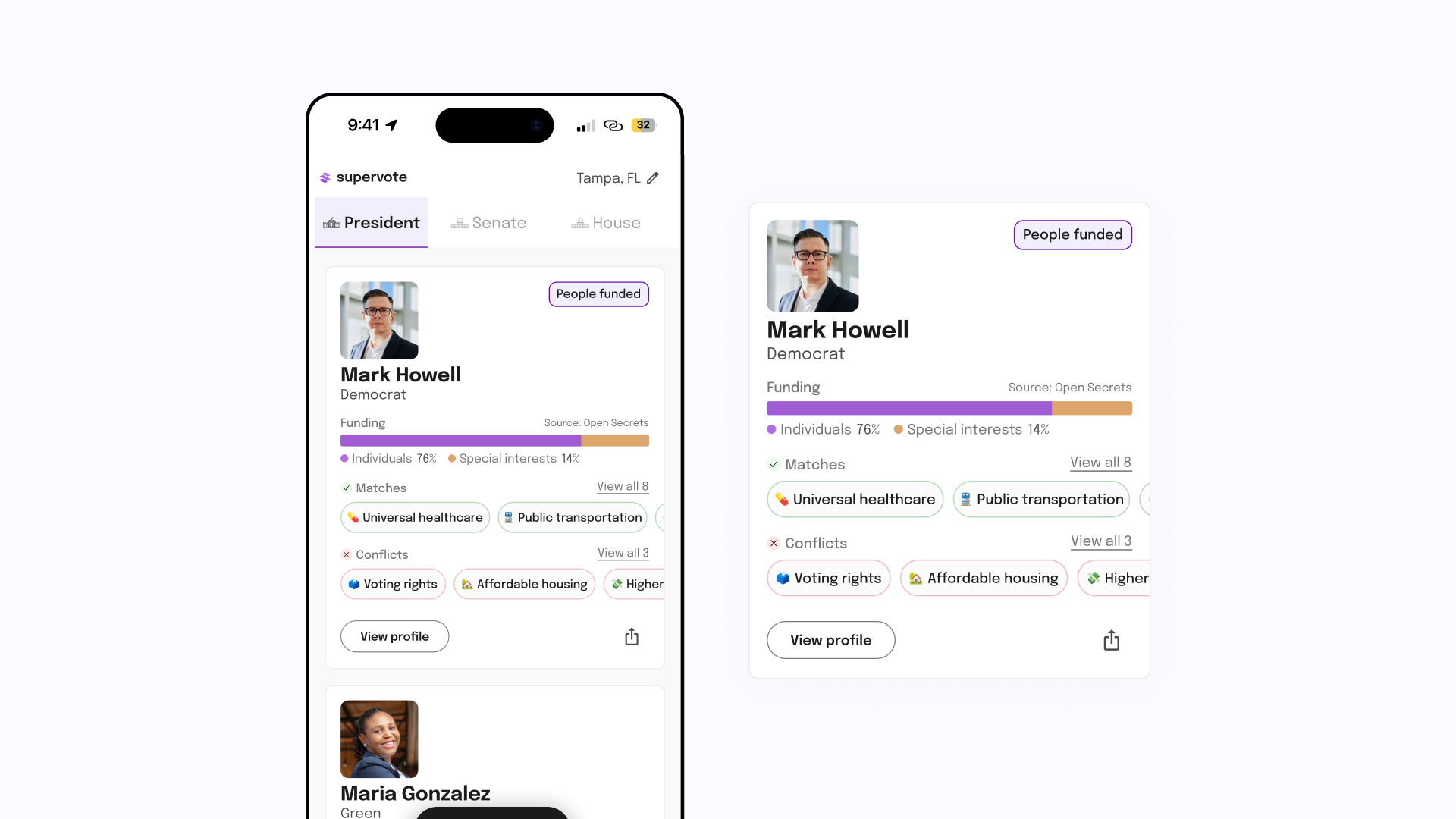
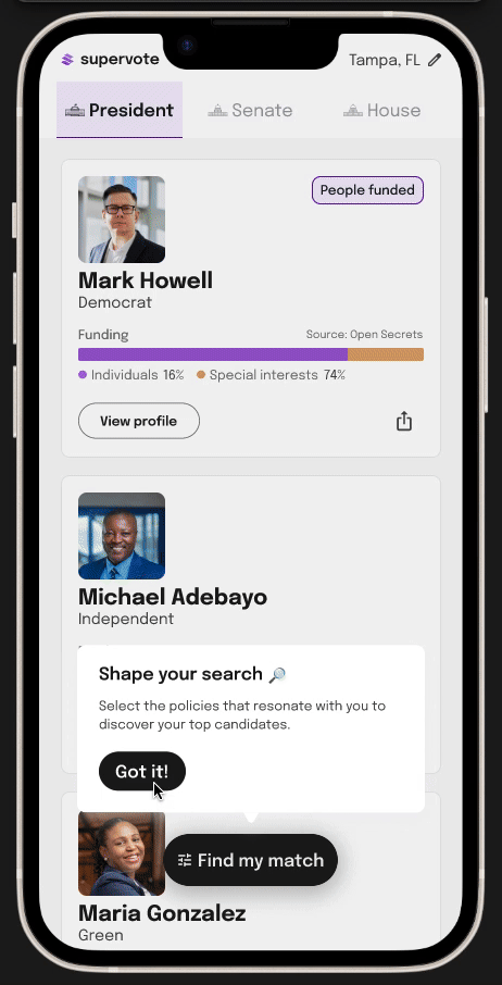
One of my contributions was designing dynamic candidate cards and filtering systems to help voters quickly compare policies and funding sources.
After surveying a few hundred U.S. voters, many shared how difficult it was to truly get to know their candidates. Even when motivated to research, the process felt overwhelming, fragmented, and difficult to trust.
Voters reported needing to jump across multiple sites, often encountering incomplete or biased sources.
Policy positions and funding data felt dense and difficult to compare across candidates all in one platform.
Many respondents weren’t sure where to start or which sources to trust besides the traditional news or even socials.
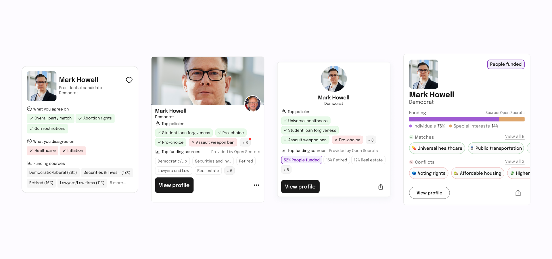
Early versions of the candidate cards were overloaded with information, which worked against Supervote’s goal. Funding sources and policy details dominated the layout, making the cards difficult to scan.
We wanted to reduce content per card and prioritize what users need at a glance. That was ensured by the following solutions:
I changed the card so that it was easier to scan by ensuring visual hierarchy. I was motivated by the natural zig zag reading pattern to shift the content from center aligned to left aligned. I introduced more white space for badges (another quick signal for users), and made profile images smaller due to inconsistent source quality.
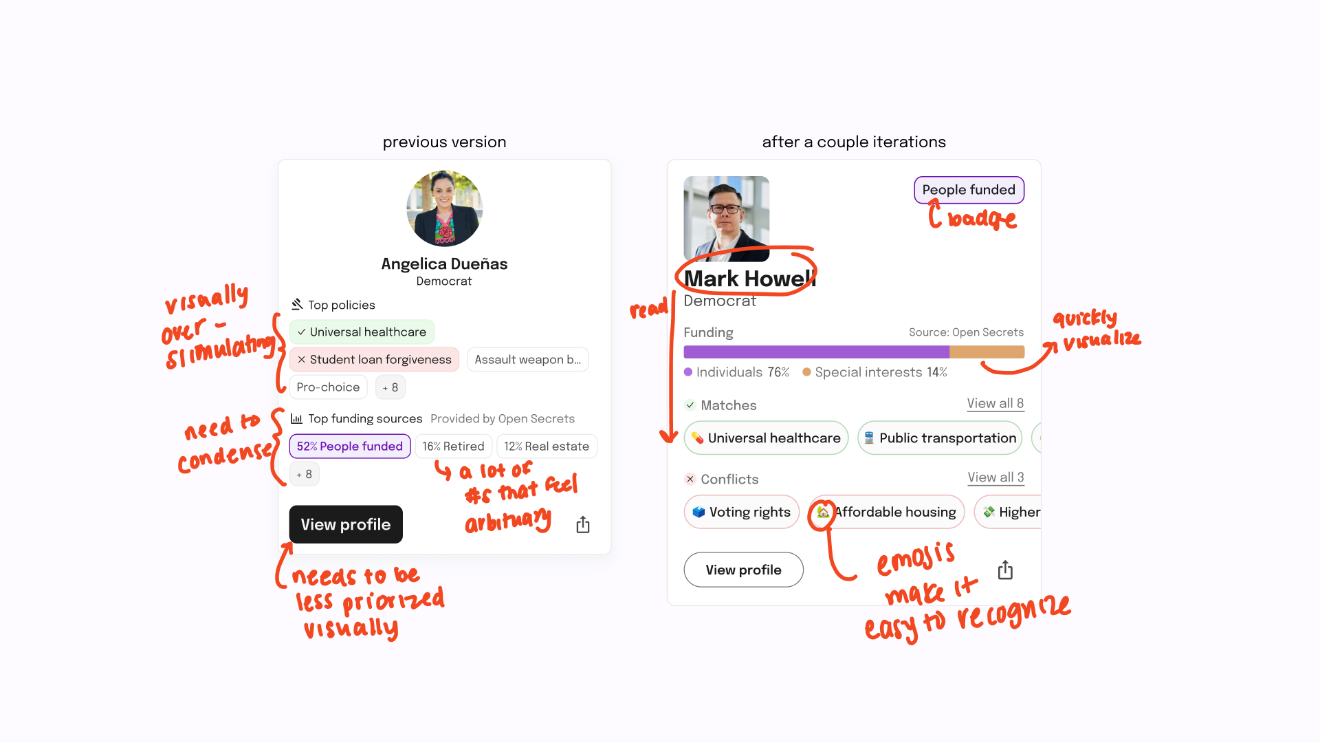
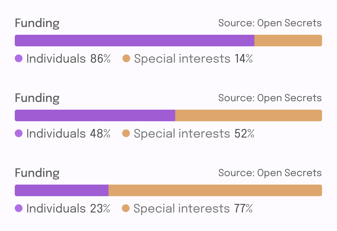
Funding sources were critical to show at a glance, since they can conflict with voters’ priorities. Our initial card design listed the full breakdown, but it crowded the layout and made scanning difficult. To address this, we simplified the categories and I introduced a horizontal bar visualization, allowing users to quickly compare funding at a glance.
Once applied, our policy filters update the card content dynamically. It is highlighted on candidate cards as matches or conflicts.
In early testing, participants felt overwhelmed by the amount of information on each card. After simplifying the layout and introducing visual summaries, later sessions showed improved scanability and easier comparison.
